We used Intercom to add £100,000s of marketplace investments at Fruitful—here’s how
Onboarding customers to your new product is tricky.
Onboarding customers to a new financial product is really tricky.
For a mountain of security and regulatory reasons you’re required to collect and validate a towering number of data points.
Of course, for each additional data point that we had to collect = additional cost to the customer = increased risk that they might drop-off and watch videos of otters eating lettuce instead.
Fruitful’s onboarding steps
In Fruitful 1.0 (more about the pivot here ) these were the steps for onboarding new users:

States and actions of the customer onboarding steps. (AML) Anti-money laundering
Our definition of a successfully onboarded customer was:
“A customer that has created an account and invested money.”
We experienced drop-offs in two key areas:
During account creation
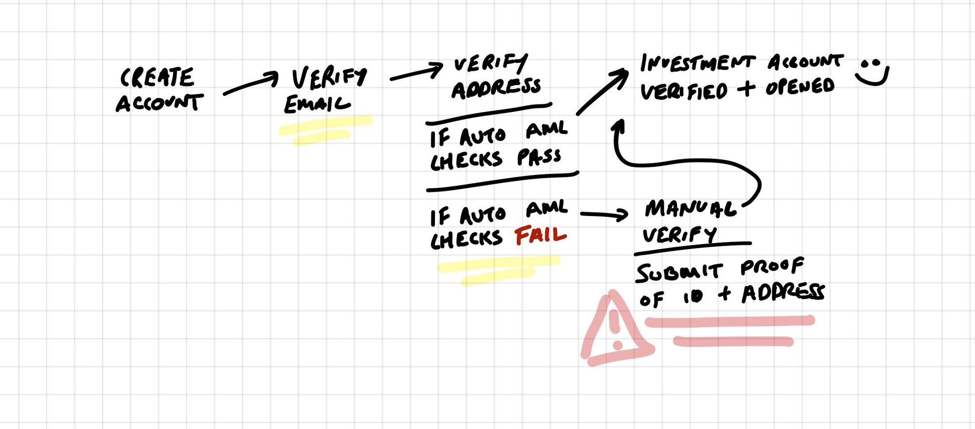
States and actions of the customer onboarding steps. (AML) Anti-money laundering
Looking at the user flow for onboarding, you’ll see that if customers failed the automated anti-money laundering checks, they had to upload:
- Proof of identification — e.g. driving license or passport
- Proof of address — e.g. utility bill
Although we lost a small percentage at the verify email and verify address step, we (unsurprisingly) lost the majority at the manual verify step. We made some assumptions for why we experienced drop-offs here:
Customers might have been at work or somewhere else outside of the home where the documents lived
Customers might have not had enough time to find the documents
More and more customers are using electronic bills, so they might have had to request a statement (or similar) from their bank
After account creation
Circling back to our definition of a successful onboard, we needed a customer to invest money to reach our goal.
This leads us into the second area we experienced drop-offs: As we began scaling the number of customers with verified accounts, a growing proportion were not investing money.

Some assumptions for why:
- People’s financial circumstances change all the time, maybe some people were waiting until they had enough money to invest
- Maybe some people couldn’t get comfortable that we were a new finance company
- Some might’ve ran into technical problems
- Some folks might’ve just been nosey
Our growing list of assumptions pointed to one thing: We needed a better way to communicate and engage with our customers throughout the onboarding process.
You won’t go wrong with Intercom
After a quick ask around, my trusty friend Francis Irving recommended Intercom.
Intercom pitch themselves as a customer communication platform. For us they offered a quick and easy way (literally, we dropped in a javascript snippet) to engage with our customers based on their behaviour.
Tracking & Segmenting
As soon as we were set up we using Intercom we started by tracking and segmenting customers. Straight away we had a birds eye view of our customers, their profile and their activity on Fruitful.
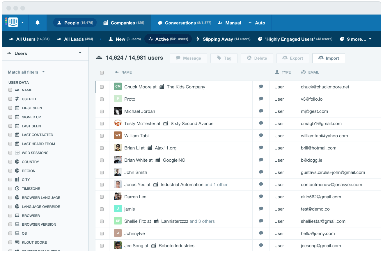
For onboarding in particular, we could see things like:
- Whether or not they’d verified their email account
- Whether or not they’d passed the anti-money laundering checks
- Whether they’d made an investment
- The last time they logged in
- The device they were using
With these capabilities, we were able to segment our customers into groups and communicate with them in ways that would help them onboard successfully.
Let’s zero-in to two segments to understand their behaviour, how we engaged with them and how we made a huge impact on the number that onboarded successfully:
Segment 1 = Fallen down the crackers:
Customers that had created their account
Had not passed the automated anti-money laundering checks
Needed to verify their proof of identity and address by manually taking photos/scanning their documents and emailing them over
Segment 2 = Flying visitors:
Customers that had created and verified their account
Had signed in 3 times or more
Had not made an investment
Reducing drop-offs
How we rescued the fallen down the crackers
To engage with the ‘fallen down the crackers’ — customers who had dropped-off after failing the automated anti-money laundering check during the account creation — we implemented the following messaging strategy:
Message [1] “It’s cool, don’t worry”:
When: As soon as the customer had failed the automated check
How: In-app message
What:
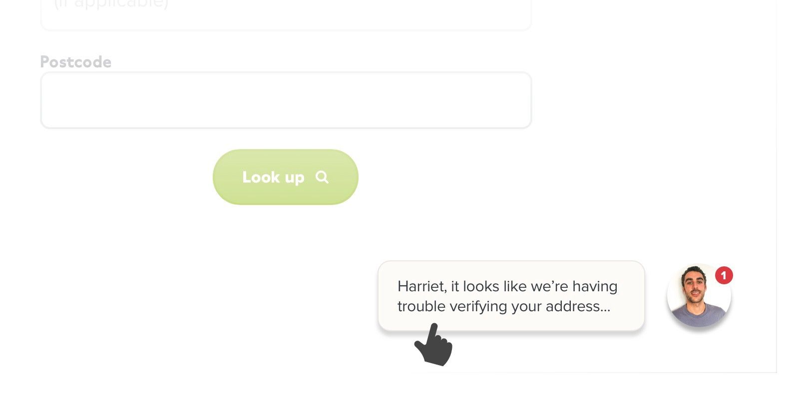
- We explained that this was nothing to worry about — you can fail the automated checks for a number of reasons i.e. recent move, not registered to vote, different registered address etc. etc. etc.
- Anchored to the point above, we reframed the problem as our problem, not theirs
- They could upload their evidence right here in the chat window if they had their documents to hand
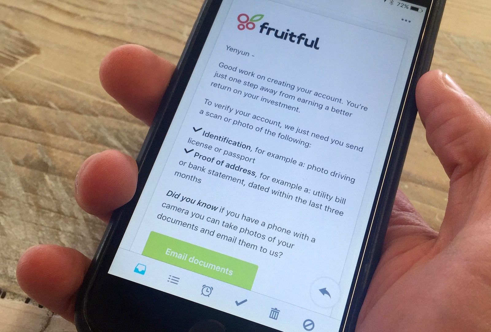
Message [2] “A quick follow up email”:
When: Sent on the same day
How: Fruitful branded email
What:
- Good work creating your account
- We just need you to verify your address and identification
- Here’s how you do just that
Message [3] “Reaching out to see if you’re ok”:
When: The following Saturday morning
How: Plain text email sent from one of our team, usually me
What:
- Is everything ok? Anything we could do better?
- We’d noticed that you hadn’t opened your account
- We’re here to help
Results & what they suggested:
- In the first week, we saw just over 18% of our fallen down the crackers go on to verify their account
- Over the course of 4 months, we increased the percentage of those who ‘verified their account’ from 61.2% to 80.6 %
- Interestingly, not many converted on the first in-app message. 58% converted on message 3 — which dovetails with our previous assumption that peeps probably didn’t have their proof of identity / address on them at the time; yet Saturdays were more convenient to dig out the said documents
- Given message 3’s performance, it’s safe to assume that most of the increase in conversions could be attributed to simply /being reminded/
- We were able to capture skeptics with message 1. A small percentage of prospective customers asked us why they had to verify their address in the first place. The in-app chat made for a excellent place to have a quick exchange with customers to explain why
Increasing first-time investments
Catching the flying visitors
The flying visitors were the prospective customers who had logged in 3 times or more, had a verified account, but hadn’t made an investment. We assumed the multiple logins might be a good proxy for; I’m interested, I’m just not sure about something.
For these customers, we engaged with them slightly differently:
Message [1] “Making an investment is easy”:
When: first visit to the deposit view
How: in-app message
What:
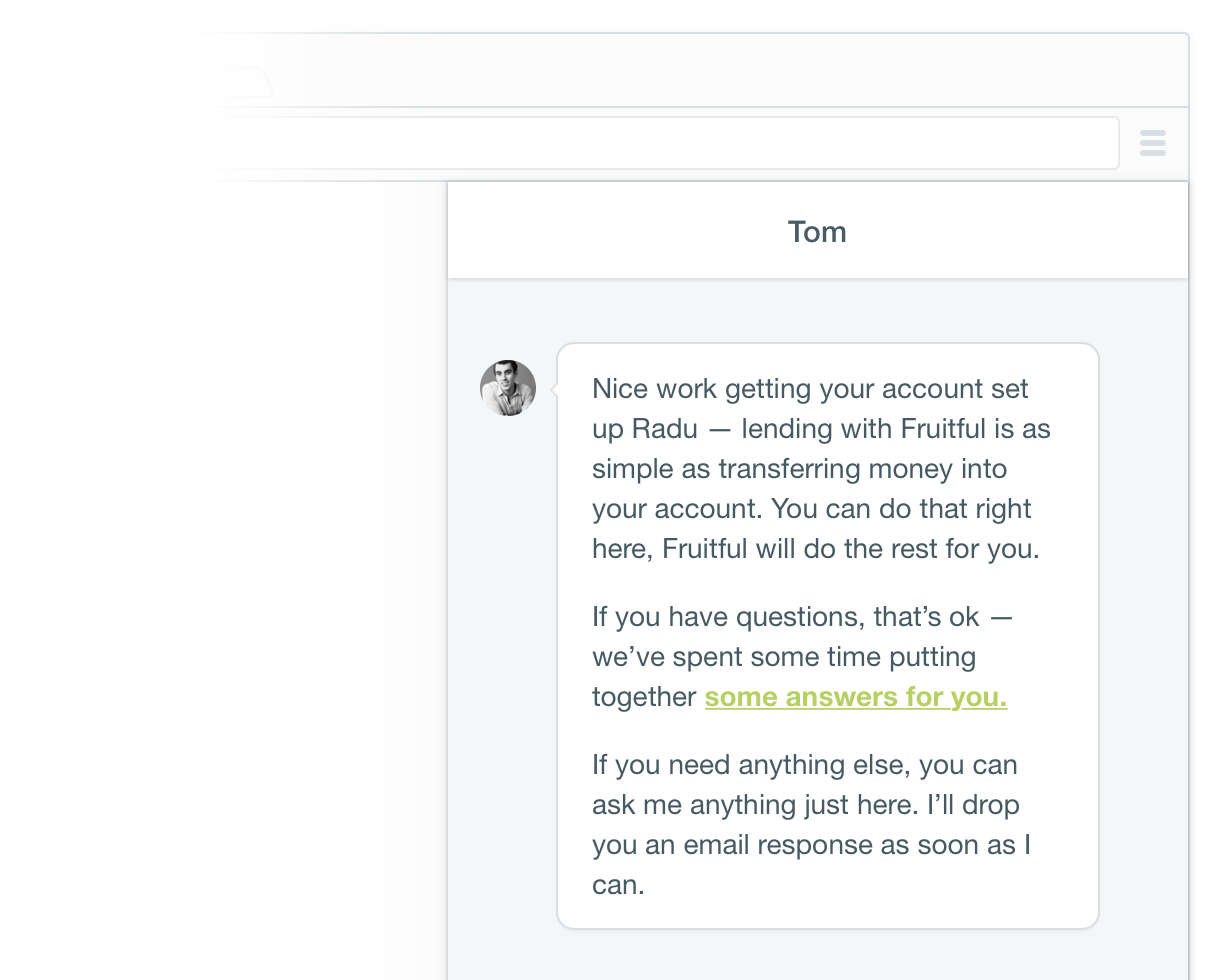
We ran an in-app message that bubbled-up on the customers first visit to the ‘make an investment’ screen. We thought this might offer some reassurance to those who were a little skeptical of a new online-only financial company.
💡 Interesting aside: We ran two versions on an A/B test and found that the message where we linked to our FAQ increased first-time investments 30% more than the message that didn’t, even though next to no one clicked the link.
Message [2] “High fives on creating your account, you’re good to go”:
When: 2 days after signing-up
How: Fruitful branded email
What:
- Congratulating customers on setting-up and verifying their account
- Presenting their account info so that they could go ahead and make a investment right there
Message [3] “See who else is using Fruitful”:
When: at least 2 days after previous message [and] only on Saturday mornings
How: Fruitful branded email
What:
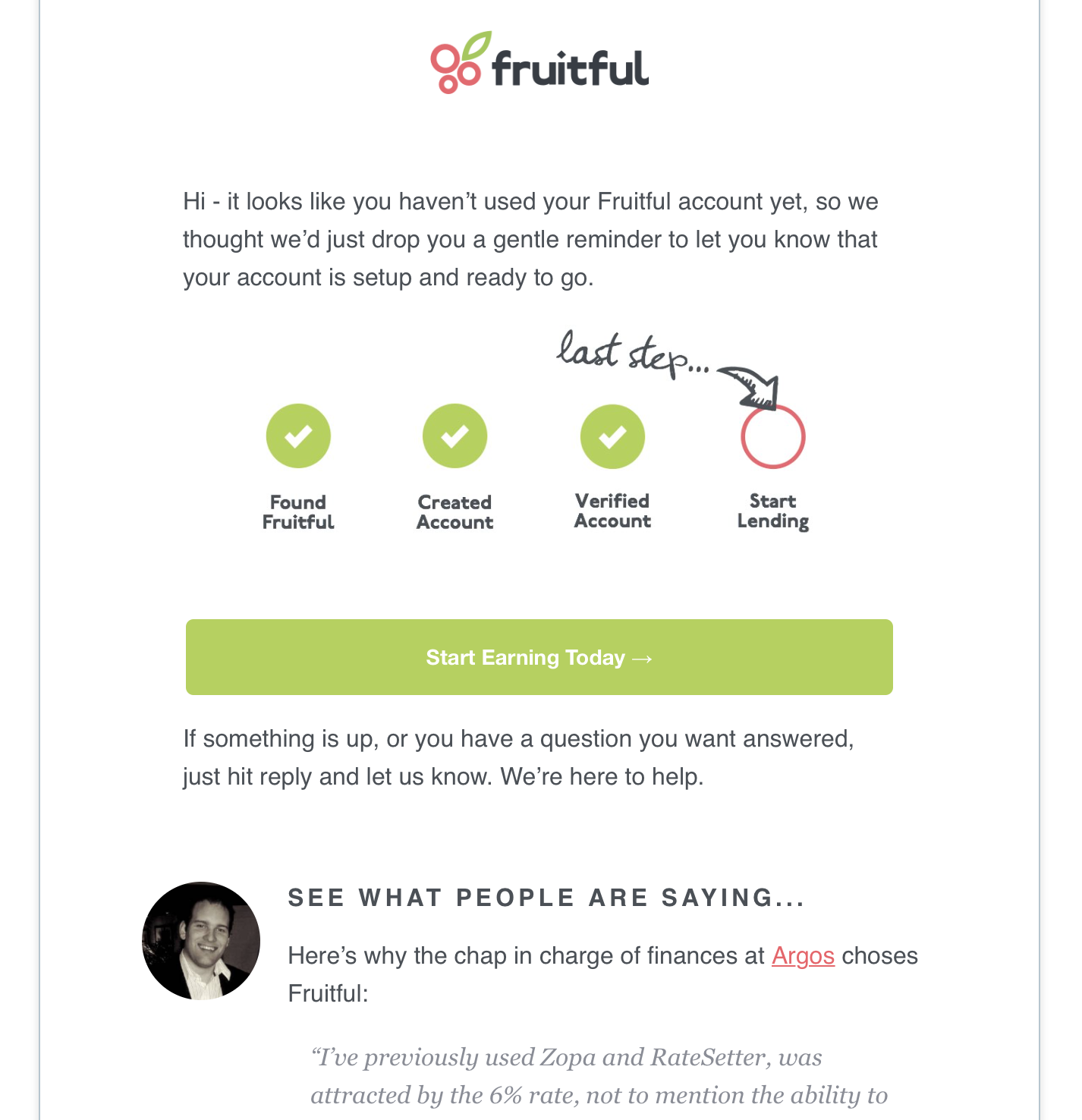
Here we offered-up some social proof alongside the goal gradient effect that shows what you’ve completed and what’s next.
As humans get closer to /reaching a goal/, their efforts towards that goal significantly increases — user interface patterns like this have an enormous impact on conversions, but that’s a topic for an upcoming post.
Message [4] “Follow-up, is everything ok?”:
When: at least 2 days after previous message
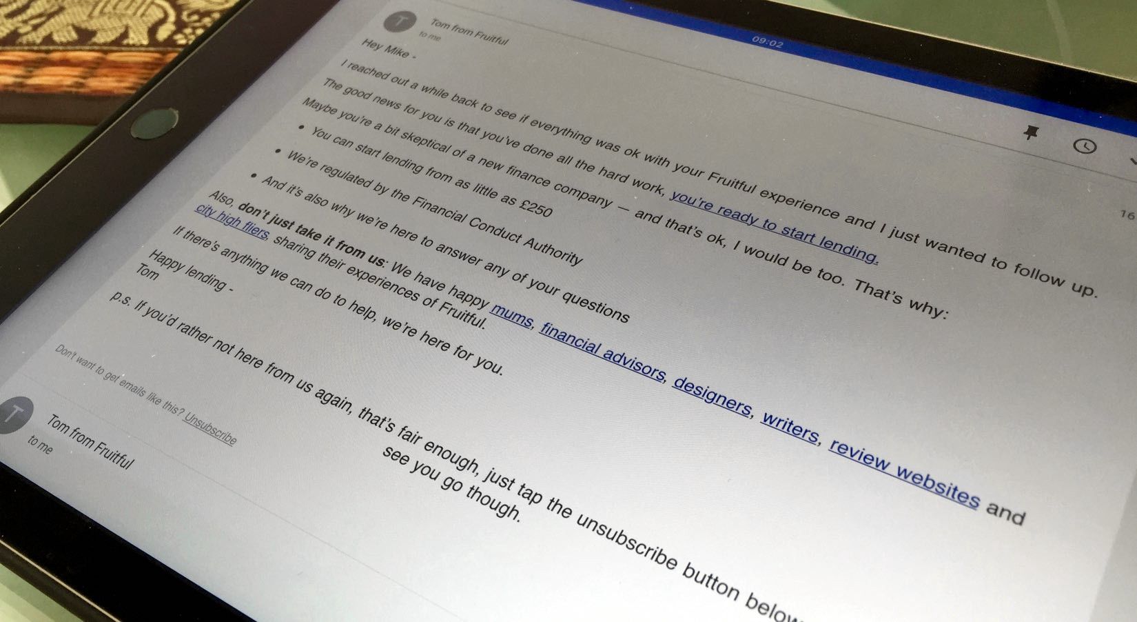
How: Plain text email sent from one of our team
What:
Results & what they suggested:
- The initial group ‘flying visitors customers’ were tagged ‘Before Intercom’ so we could see the before and after. In just two weeks we converted a towering 23.8% of them to successful onboards (i.e. made an investment)
- In net marketplace investments, that equated to over £160,000
- Out of the successful conversions, messages 1 and 2 accounted for 78.8% of the conversions
- Importantly, message 4 prompted some customers to ask us extra questions that helped them get comfortable with what we were offering. A few of those went on to be some of our largest investors
- Ultimately as a new finance company we were selling reassurance. Using Intercom to engage with customers at appropriate moments with relevant messages helped us do just that
Some takeaways
After spending a bunch of time knee-deep in Intercom, we began to figure out what worked well and what didn’t. In no particular order here are some takeaways I’d offer:
The power of plain text
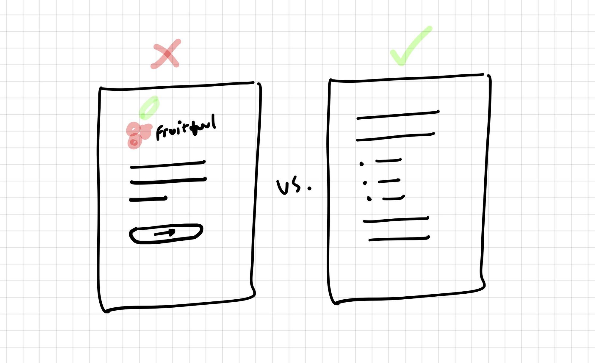
We found that more often than not, emails that were sent in a plain text format from an individual (someone from our team) performed better (increase in step goal) than those emails from Fruitful, in a branded email template.
Work that scheduler
Assuming you’re using Intercom, get creative with the message scheduler and think of sending messages at times that fit your customers’ context. Context could mean, where they are, what time of day, the device they’re using and so on.
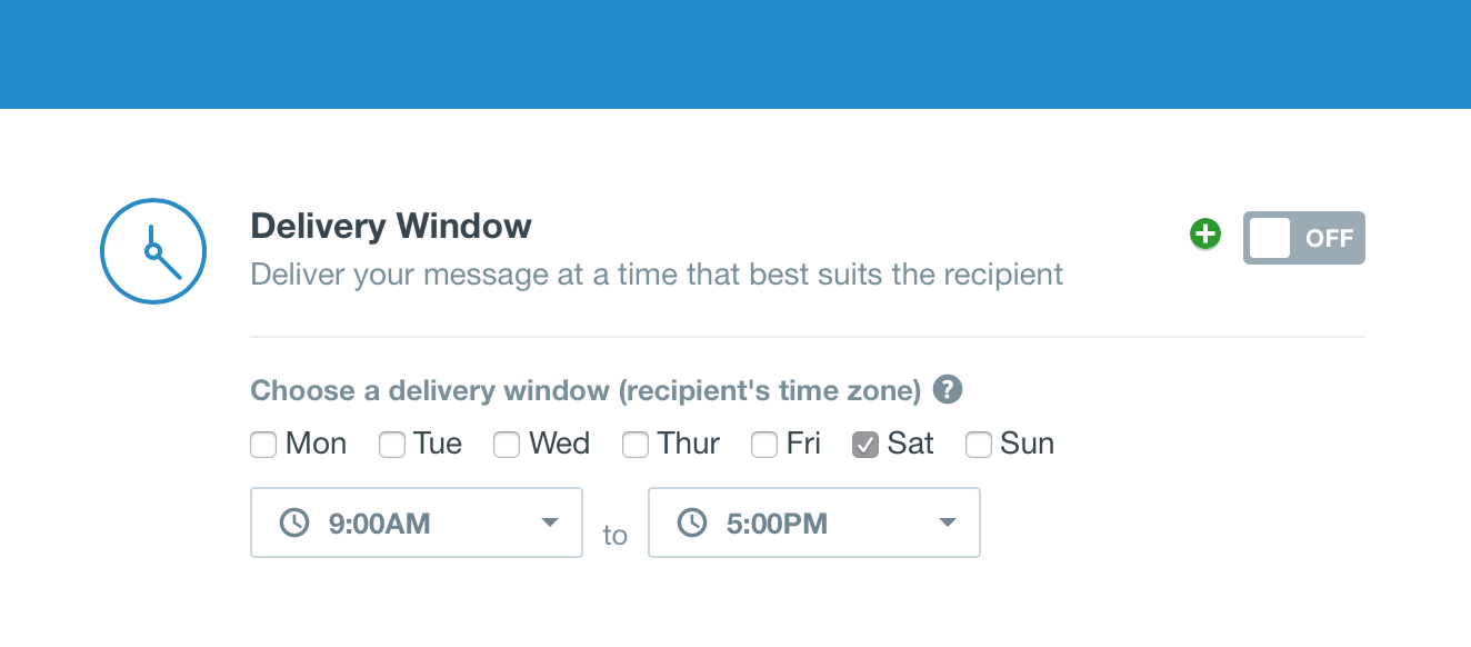
We found that messaging customers on Saturday mornings to send us their proof of identity and address was most effective. Why? A safe assumption might be: Most people would be at home on a Saturday morning and therefore they’d be able to dig out their documents, dust them off and email them in.
Be the best with an A/B test
Whatever customer engagement product you go for, make sure you can run A/B tests on the messages that you automate.

We found this to be super powerful. As we mentioned above, simply offering a link to our FAQs increased the number of customers that made an investment by 30%.
No A/B tests, no way to iterate, measure and improve.
Approach requests for feedback like dating
Haven’t been dating in over half a decade so I could be way out west on this analogy — but! Intercom is a superb fit for collecting customer feedback.
Like dating, you don’t want ask for everything on your first meet. Be succinct when you ask for feedback. We removed friction even further on our initial feedback requests by offering up simple thumbs up/down vote—like a cheeky wink from the other side of the room to gauge the response.
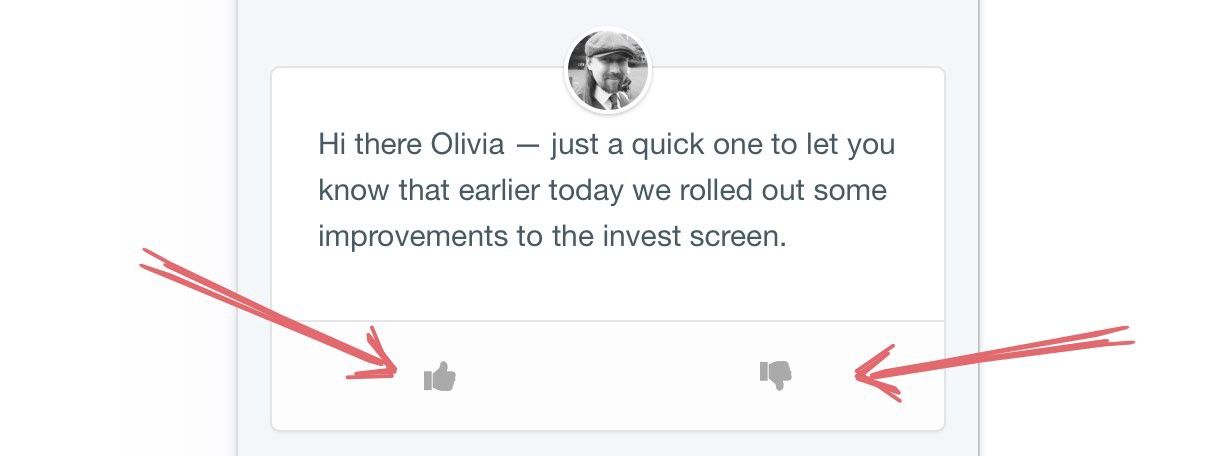
If we received a response (akin to a swipe on Tinder?), we’d follow up with something like:
“Hey Olivia, just wanted to follow up to get your thoughts on the updates to the invest screen. Can you tell me what’s not working for you?”.
Asking customers to write a testimonial for you is a big ask—like do you want to move in with me big—but asking customers if they’re happy with you publishing their positive feedback they’ve just messaged you certainly lowers the bar.
Forgotten what happens in dating after this, so probs best to leave this here.
You can have 1 but you cannot have 2
With all your messaging, you want to present just one call to action or question, i.e:
Hey Phin, we’ve just rolled-out an update too the withdrawal screen — is it clear how you’d make a withdrawal?
You’ll only be disappointed with your results if you ask for more than one thing. Either one thing will get missed, or customers will ignore your messsage all together.
Get respectful or die tryin’
To finish on finger-pointing housekeeping note: Be mindful of your customers when you’re implementing your messaging plan. Specifically, make sure you’re not bombarding your customers with emails and in-app messages everytime they login—attention is a finite resource and your customer engagement strategy should be mindful of this.
Intercom has a simple yet powerful tool to help you regulate the time between contacting customers—you can target based on last contacted.

Overlook the importance of this and you’ll run the risk of customers hitting that juicy unsubscribe button which, to be clear, brings all of your wonderful customer engagement plans to a screeching halt.
Stay tuned
Be sure to follow Fruitful’s Ingredients blog so you can join us in an upcoming post where we’ll look at how we made changes to our user interface designs that resulted in double digit % improvements to our successful onboarding rates.
Always read the Ingredients. Have the occasional note, insight or idea on topics such as design, software development, hiring, finance and keeping your sanity when building a company delivered fresh, right to your inbox ➙
Thanks to Paul Bennett-Freeman.
