Can Simon Manchipp Help my Start-Up?
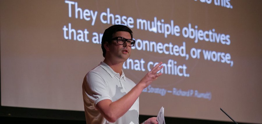
A few weeks back I was lucky enough to see Simon Manchipp speak at the Liverpool based design conference Designival. If you haven’t been to one before, I'd recommend you do.
The thing I found most engaging about Simon’s talk was his position on logos and branding. For personal reference, I made a few notes thinking about how the the themes could be applied to my new project, Beanbag.
My Notes & Thoughts:
1. Consistency is not stimulating.
2. Create conversation that joins things up.
My thoughts: Important. Instead of trying to push our message to customers, we should be creating campaigns that involve them in the conversation.
I’ve been planning on starting something along these lines for the Beanbag launch. Being a link organising and sharing website, we have some rough ideas for running a little competition / exercise. Still in its infancy but we could go for something like… using the hashtag #mybeanbag, tweet a link that:
- says something about you
- inspired you & why
- made you laugh
With proper execution, this should:
Help spread our message
Involve our customers
Satisfy our customers’ needs for self-expression
Be much more interesting, engaging and affordable than placing a full page ad in the Guardian.
3. What does the brand stand for?
My thoughts: Our brand should be opinionated.
We’re building Beanbag primarily for ourselves. We’ve tried other products but feel that speed, simplicity and passing-on has been overlooked.
This should be consistent within our marketing message. We didn’t like X, Y & Z > so we did this. Which side of the fence are you?
4. Brands are actions, not words.
My thoughts: We better do a good job of delivering on the above =)
And my Grandmother’s old saying springs to mind:
“Handsome is as handsome does.”
5. Logos are not conversational.
My thoughts: Valid. But they’re an important part of a brand’s DNA and their value should not be discounted as much as Simon suggested.
However I do agree with the notion that a compelling visual identity is not enough on its own.
In order of importance – for me – a brand’s composition goes a bit like:
Actions [our product or service]
The visual identity [logo and design language]
Our content and marketing messages
6. Consider adaptable logos.
My thoughts: Interesting concept. Effectively Simon suggested designing logos with:
Fixed assets: parts of the logo design that are consistent i.e. the shape
Flexible assets: parts of the logo that are customisable i.e the colour
A good example: Android man. Do what you want with him.
We’ve since considered allowing users to select their Beanbag colour during the sign up process. Along with that, we plan to allow users to select colours for their bundles (used to organise links within Beanbag). Blue for ‘Technology’, pink for ‘Shopping’, orange for ‘Music’, green for ‘Gardening’ etc etc.
7. The brand story needs to be beneficial to the customer.
8. Weird is remembered and creates monopolies.
Case in point; compare the meerkats. A wonderful and funny narrative that’s intelligently connected back to the core message – find cheaper car insurance.
As it happens, they send you a free meerkat (I have Vassily), when you order insurance through them. Each time my friends and family visit, they pick him up and we end up having a conversation about Compare the Market.com that they haven’t even paid for. MoneySuper what? Weird monopoly.
So how will this thinking help our startup?
Well, we can employ most of these ideas on a shoestring budget.
Better still, there’s clear evidence that even in a crowded marketplace – where attention is scarce and content is everywhere – original design and marketing is remarkable (worth making a remark about) and cuts through the noise.
So thanks to Simon and the team at Designival for an inspiring and thought-provoking few days. As and when I get the time I’ll be documenting how these ideas evolve and work out in practice across the coming months.