Lazy Loading Responsive Images
Learn more below or see the Demo →
Most of last week I was rebuilding a website for a longstanding client. Performance (i.e.how fast the thing renders) is not only important to this client, it’s imperative. A good proportion of their customers live out in the sticks, and as a result, many have slow internet connections.
Lazy Load to the Rescue
To speed up page load, we decided to use the popular Lazy Loader plugin which defers the initialisation of images until they were needed. Most importantly though, users on slow connections would have the (essential) page content loaded almost instantly, while (complementary) imagery could download subsequently.
Lazy wants to know!
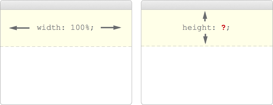
The problem: Lazy Loader demands that we define the width and height of our images.
“Note that you must set image width and height either as attributes or in CSS. Otherwise, depending on your layout, plugin might not work properly.”
Since we were using a flexible grid, we knew that the image width was going to be 100% of its context. However, we couldn’t define a height. If we did, when the grid fluctuated, the ratio of the image would impair.
Actually; Ratios to the Rescue
In theory, we knew we needed to define a ratio in CSS. We needed the height of the image to be relative to its width.

I’ve seen a number of JavaScript plugins which enable this, but I was sure there would be a way of using the browser’s presentation semantic, CSS, to do the job properly. This would prevent flashes, reduce load time and help me sleep at night.
Here’s an example JavaScript flash that’ll keep you up all night vs. the fluid / responsive, lazy-loaded image demo site:
The pixie dust
1] We create our markup; a container element which will house our lazy load image:
<div class="panorama">
	<img data-original="/images/example.jpg" src="/images/lazy-grey.gif" />
</div><!— /.panorama —>
2] We define the styles for our container element “panorama”:
.panorama {
    position: relative;
    padding-bottom: 24%; /* our ratio for this image, you can adjust this accordingly */
    padding-top: 30px; /* IE7 fix */
    height: 0;
    overflow: hidden;
}
3] Then we define the lazy image like this:
.panorama img {
    position: absolute;
    top: 0;
    left: 0;
    width: 100%;
    height: 100%;
}
Here’s what we’ve done…
In short, we’ve created a container element, which, using the height 0 trick in combination with the padding bottom percentage (to define our height) gives us a contextual ratio for our image. Combine this with a cheeky absolutely positioned image with a height: 100%; and width: 100%; statement and we’re laughing all the way home. No flashes on lazy loaded images, no rendering blips and only a few lines of additional code.
If you haven’t already, checkout the Demo →
I’ve made the demo repository public on GitHub for your.
This has been tested in a whole bunch of browsers but if you run into any problems, drop me a tweet and I’ll see what I can do to help.