Keep peddling until you find the right problem
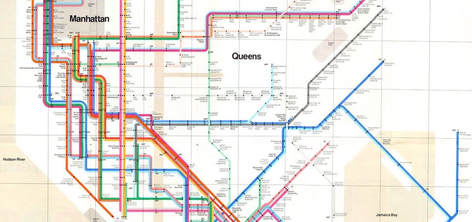
Back in August 1972, New York’s Metropolitan Transportation Authority introduced the late Massimo Vignelli’s new map of the subway system.
New Yorkers were furious.
Complaints came flooding in:
“Stations seemed to be in the wrong places. The water surrounding the city was coloured beige, not blue. As for Central Park, it appeared to be almost square, rather than an elongated rectangle.”
To Vignelli’s mind, that was the entire point (emphasis added):
“Massimo Vignelli, had sacrificed geographical accuracy for clarity by reinterpreting New York’s tangled labyrinth of subway lines as a neat diagram. Each station was shown as a dot and linked to its neighbours by colour-coded routes running at 45- or 90-degree angles.”
The point here is that Vignelli — standing on the shoulders of giants — had intimately understood the problem that he was designing for.
First and foremost, the design problem itself had been teased apart and interpreted as two goals:
- Clarity — how might we enable passengers to see the available journeys and destinations on the map?
- Accuracy — how might we reflect the locations and landmarks of New York on the map?
A problem well stated is a problem half solved
When it came right down to it, the job-to-be-done here was enabling people to easily navigate New York’s subway network.
With this front and centre of mind, it made absolute sense that the clarity of the available journeys and destinations on the map were prioritised over the accuracy of proportions and locations of New York’s landmarks. After all:
- This was a map of the subway, not of the city – /decreasing/ the importance of geographical accuracy
- The subway map would’ve been used frequently by tourists, business travellers and other people passing through the city – /increasing/ the importance of clarity and ease of use
Switch the order of those priorities and Vignelli would’ve created a different result. In particular, he would’ve traded off those overtly geometric and simplified journey lines for more intricately detailed, geographically accurate ones.

Circle back to our job-to-be-done and it’s clear that if he’d prioritised accuracy first and clarity second, Vignelli would’ve taken the solution away from its original design problem: Enabling people to easily navigate New York’s subway network.
With a clear understanding of the problems and how they should be prioritised, Mr. Vignelli had used his design skills to tidy up reality with clarity.
If this sounds obsessively detailed it’s because it is.
As Vignelli demonstrated, when you’re designing a solution it’s more than important you get intimate with the problem in ways that help you steer your priorities and make the right trade offs.
You can afford to ship a mediocre product that solves a real problem, but you’ll be treading water shipping a perfectly designed product for a problem that doesn’t (really) exist.
To my mind, elegantly solving the right problem for your customer has always been the real artful piece of product design.
Join me in an upcoming post (or two) where we’ll explore other great examples, as well as a powerful approach for locating the right problems to solve for the products and projects you work on.