Fruitful Product Marketing
Fruitful is the company I’m co-founder of. We’ve built a product that enables people to lend directly to mortgage borrowers.
The Problem
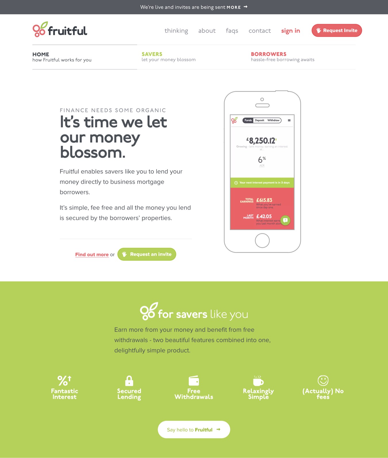
Launching a new financial product into the world is tricky to get right. We needed a website to market Fruitful’s product, team and culture.
To engage prospective customers, we needed to articulate the key features of lending with us — which were:
- Healthy interest rates — by lending directly to borrowers.
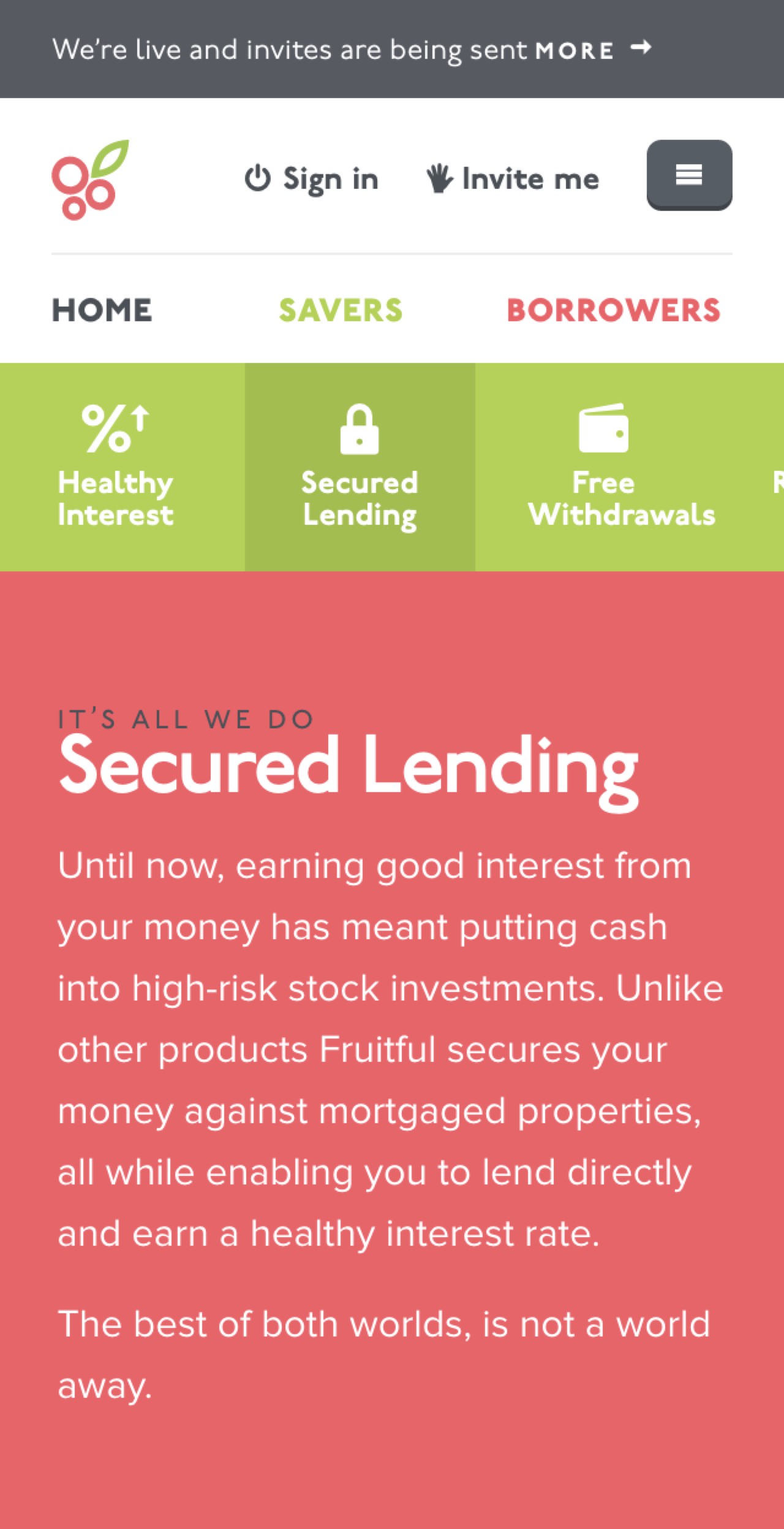
- Secured lending — the money you lend is secured against the borrowers’ properties.
- A relaxing simplicity — Fruitful automates the process of lending, withdrawing and diversifying your funds (lending to a number of different borrowers).
But most importantly, we needed to present our company’s message in a way that would help prospective customers trust us with their money.
Solution Design
Content precedes design. Design in the absence of content is not design, it's decoration.
— @zeldman
The first thing we needed to do; figure out how we wanted to pitch the product.
The content we created needed to help prospective customers with their goals of figuring out:
- What on earth is this thing?
- Do I even care?
- Can I trust you?
- How might I get started?

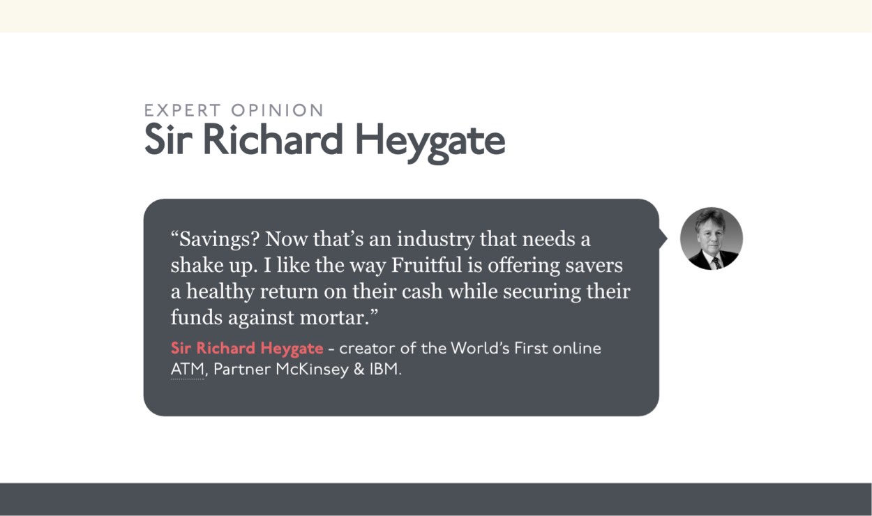
We used customer reviews and endorsements from recognised experts to offer up some validation to perspective customers.
A Visual Understanding
Since one of our key goals centred on developing trust, we needed make sure customers understood our proposition. Understanding = Trust. Our understanding of ‘things’ are made up of conceptual models. We all form them.
Conceptual models are usually highly simplified explanations of how something works. The bizarre thing is, they do not have to be complete or even accurate, it just needs to be useful. They are most useful when they help users develop and understanding in predicting how things will behave.
— Don Norman, The Design of Everyday Things
We designed a simple conceptual model for how Fruitful works.
The how Fruitful works animation demonstrates (in broad strokes) how funds are lent out and withdrawn.
A Mobile-first Approach
Fit & Finish
![Header with rulers and guides]
To achieve harmonious proportions, we used a modular scale. Sass modular scale was incredibly helpful in doing most of the mathematical heavy-lifting.
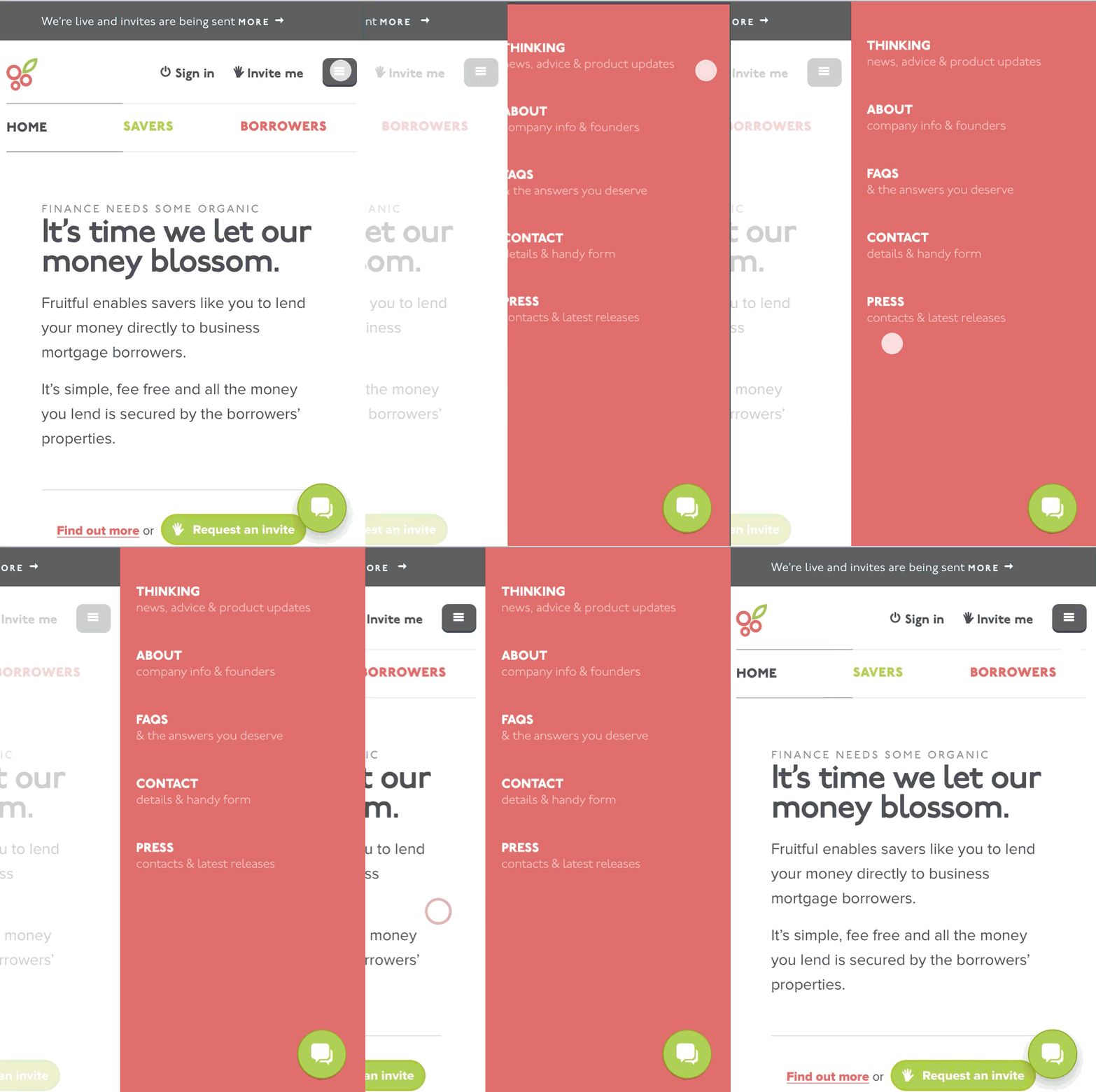
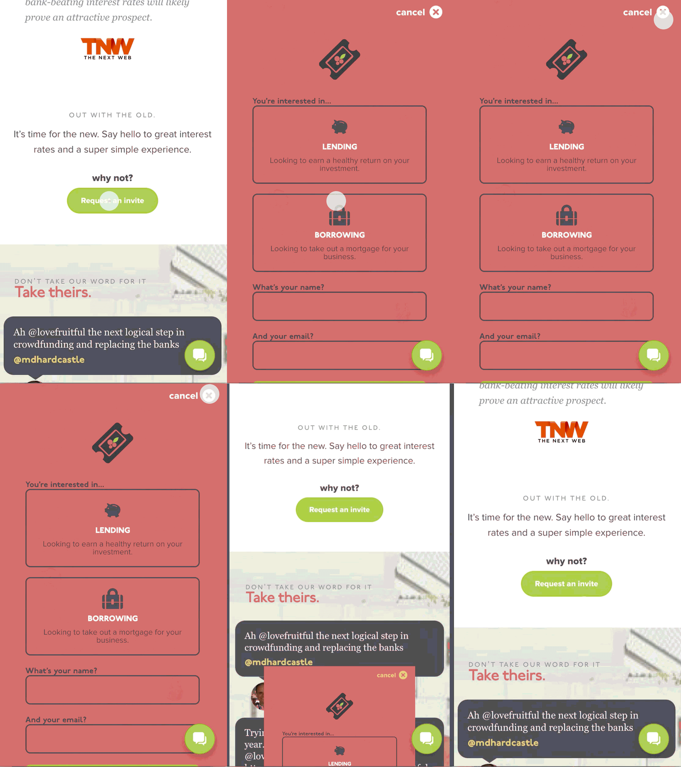
Appealing to customers’ visceral reactions, we spent time a good deal of time developing animations — conveying a level of fit and finish and attention to detail that you can’t help but trust. Michael Villar wrote a brilliant post on how they use animations at Stripe.
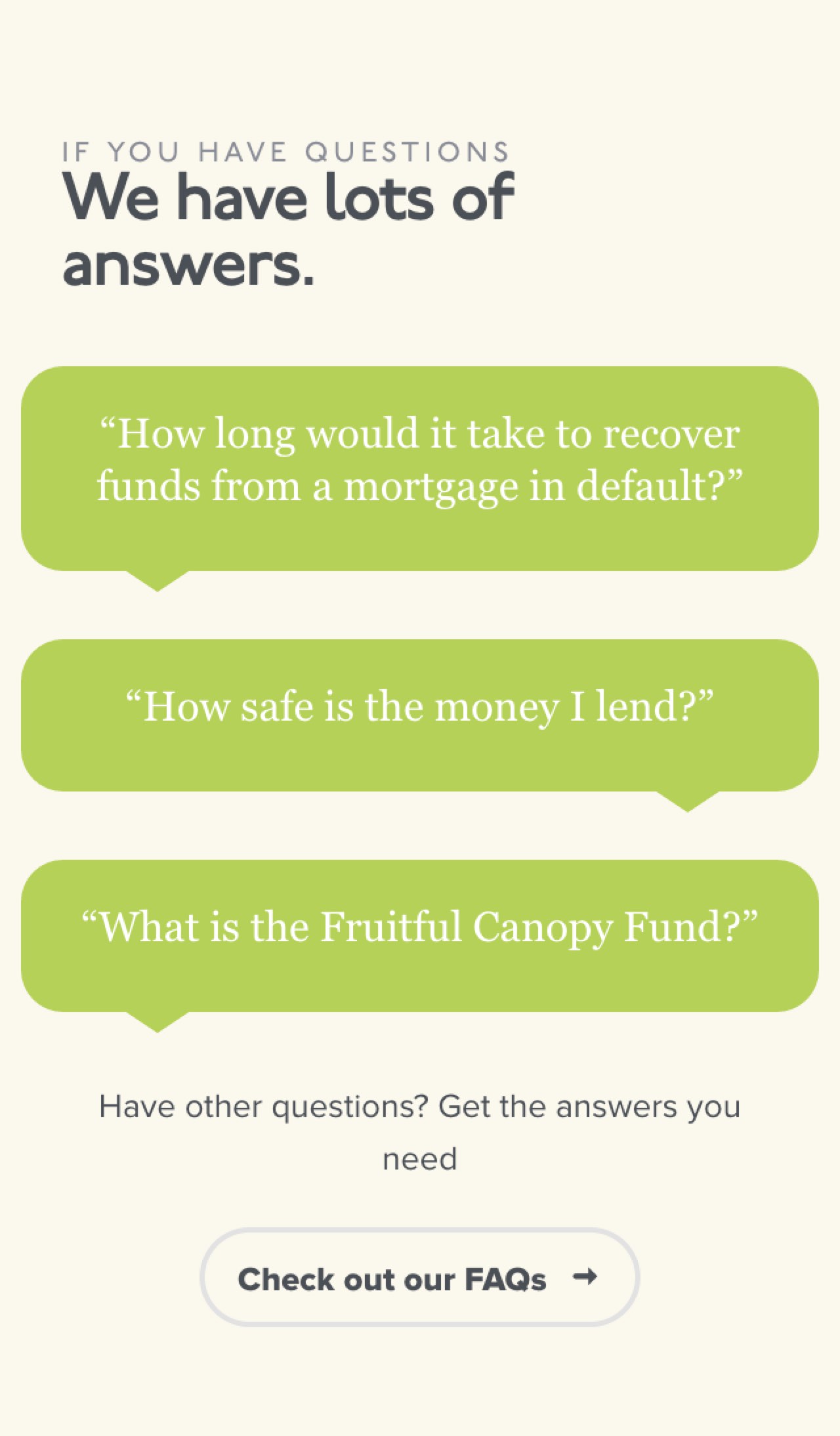
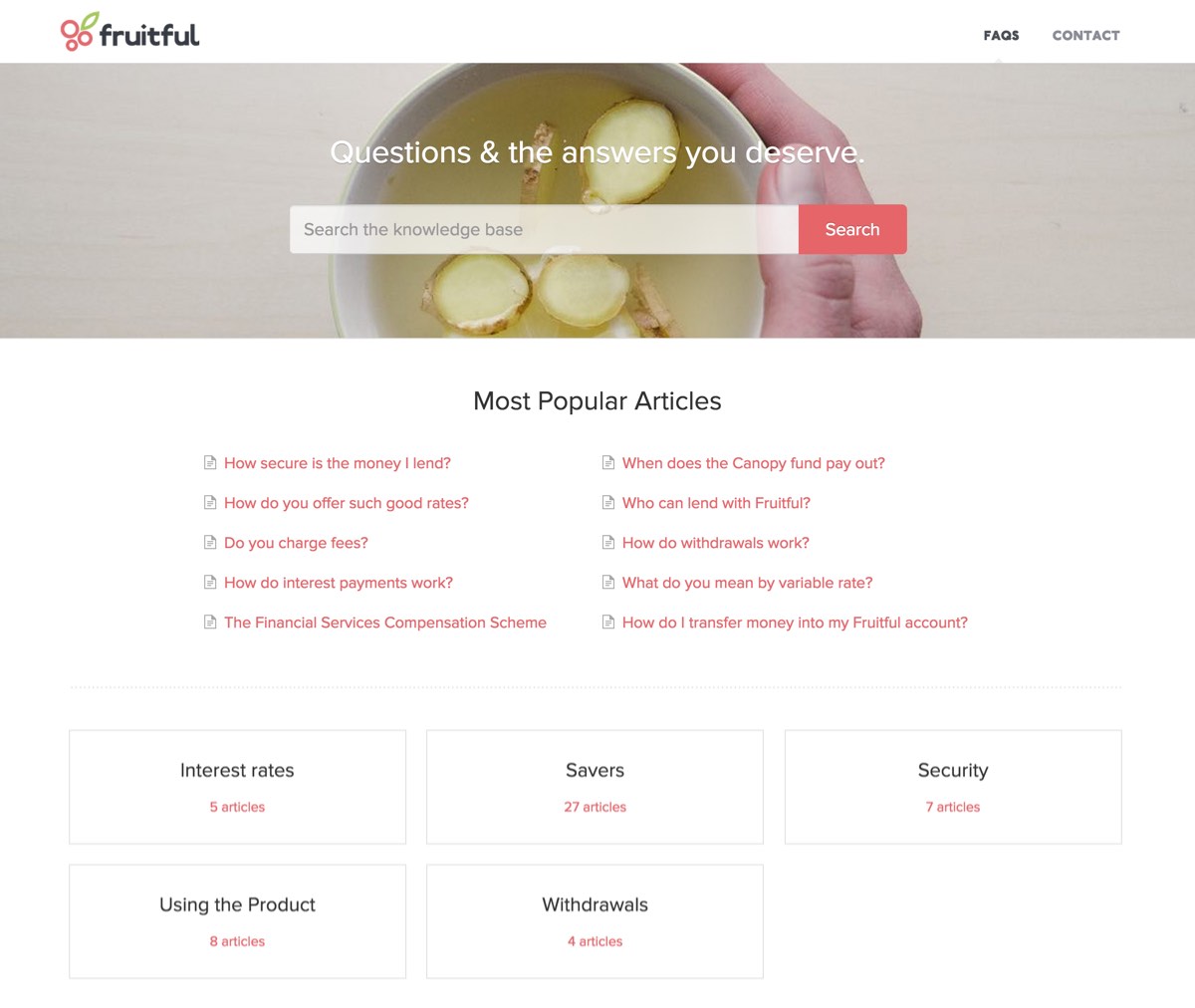
Frequently Asked Questions
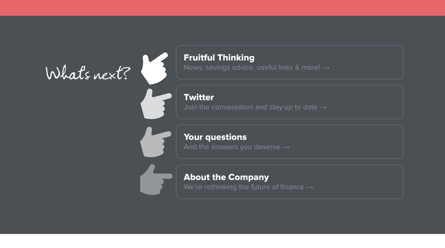
What’s Next?
Review
For me personally, the biggest success of this work lies in knowledge that we converted a high proportion of customers that had previously considered using peer-to-peer lending, but hadn’t made the jump.
That was, until they found Fruitful. In their words, they chose Fruitful because:
- We explained things properly. Link
- We carefully designed the onboarding experience. Link
- We worked relentlessly to find a way through the complex, to create something simple and easy to use. Link
- We are trying to make a difference. Link
On top of that:
- We now have customers from over 200 cities around the world.
- We successfully positioned Fruitful as a simple, energetic and rewarding challenger brand.
- We converted an impressive amount of customers in our first 3 month soft launch. (We may share our numbers in the not so distant future).
- We attracted press from respected tech publications.
- I was invited to speak at the Data Visualisation Summit in London to talk about our use of visual data at Fruitful.
