Fruitful Onboarding
Fruitful is the company I’m co-founder of. We’ve built a product that enables people to secure a healthy return on their investment by lending directly to mortgage borrowers.
The Problem
Onboarding prospective customers to a financial product is tricky.
For a mountain of security and regulatory reasons, you’re required to collect (and validate) a huge number of data points. Of course, for each additional data point that we must collect = additional risk that customers might give up on the sign-up process all together.
We decided that for our onboarding experience to be successful, we needed to focus on helping customers:
- submit their information accurately
- work swiftly through all of the form fields
- feel reassured and confident that they would complete the sign-up
Solution Design
Focus = ↑ Accuracy
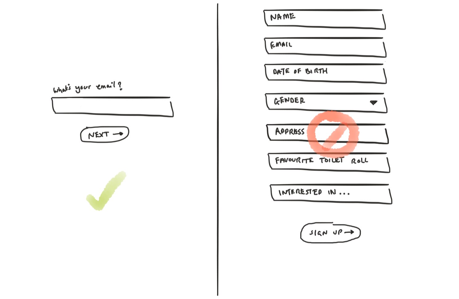
Instead of overwhelming users with one, huge form, we decided to break down the onboarding experience into little bitesize forms — focused on a specific context:
- Account type (Tell us if you want to be a business or personal customer)
- Create account (Tell us your name, gender and date of birth)
- Confirm email (Show us that your email is real)
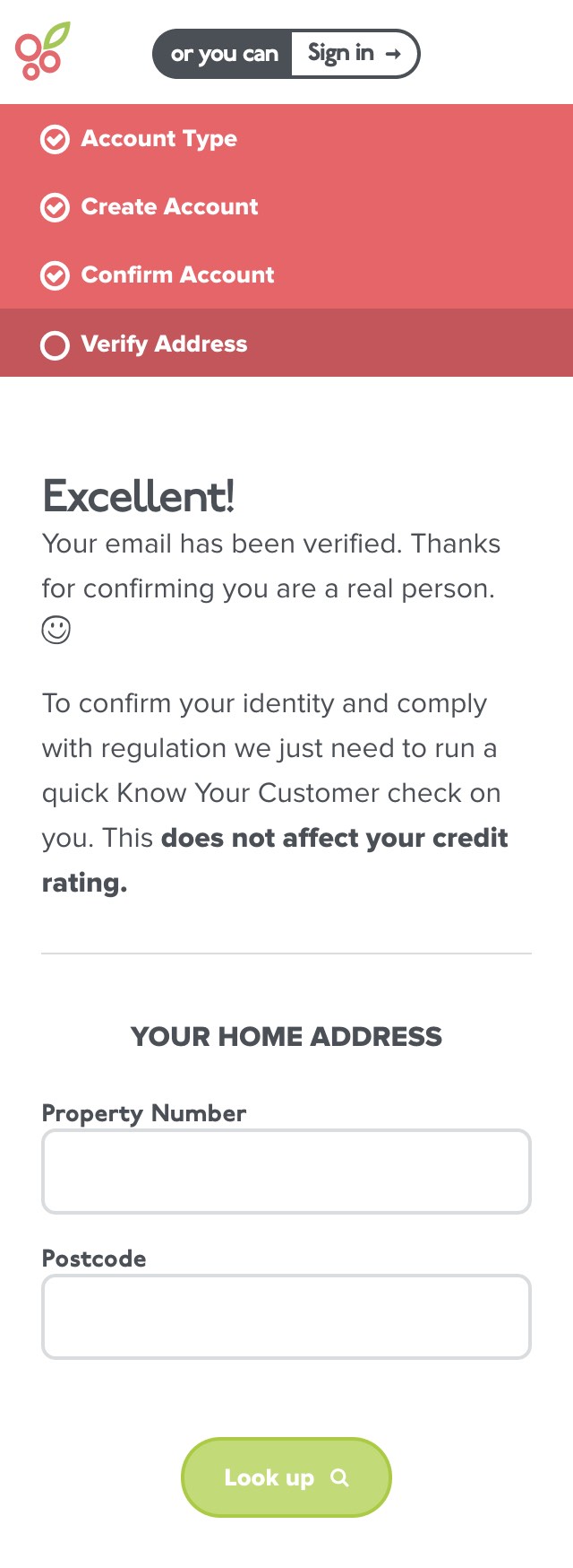
- Verify address (Tell us where you live and we’ll verify who you are)
By building smaller, contextually focused forms, we remove distractions and help our customers concentrate on one thing at a time.
Placards = ↑ Accuracy
To help customers correct any incorrect details they might have provided, we built a placard view — enabling users to review the information they’ve provided before submitting.
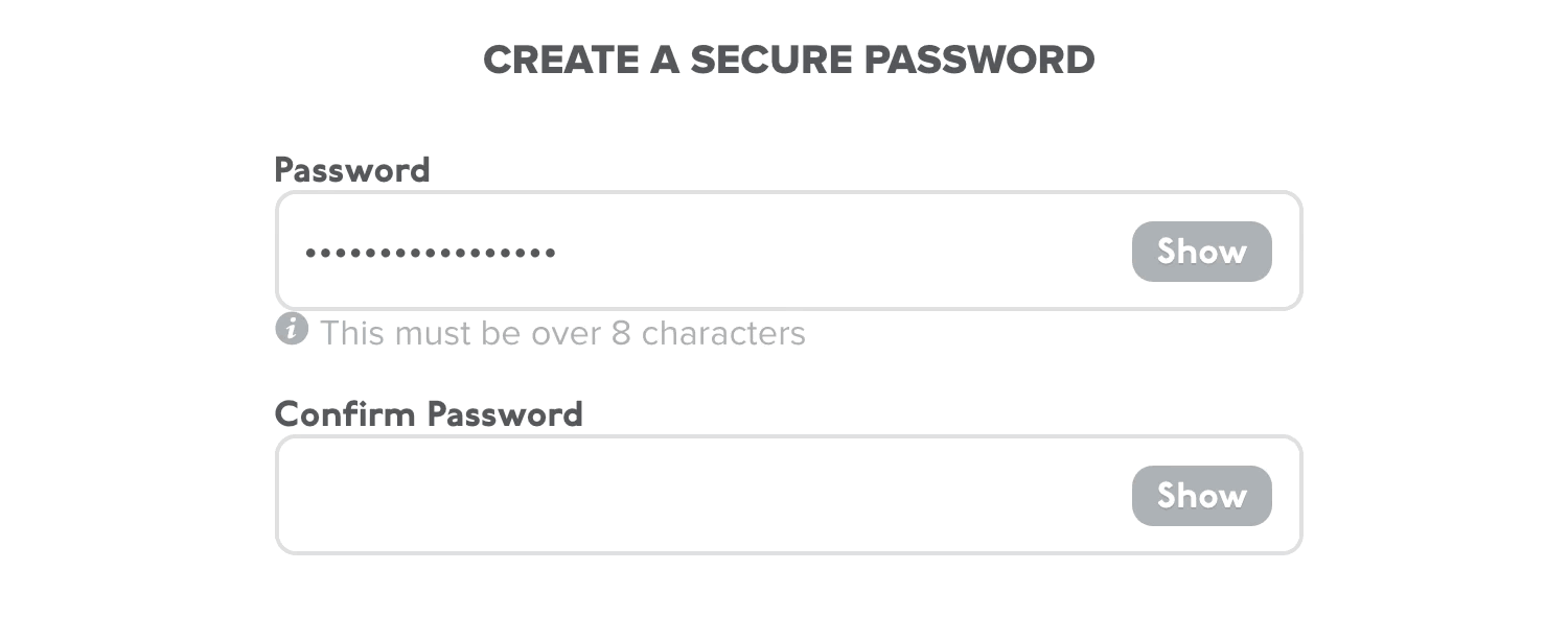
Password reveals = ↑ Accuracy
It’s easy to make a typo when you’re tapping away on touch screen devices. For the most part this doesn’t really matter — the autocorrect engines in iOS and Android mostly course-correct you.
This doesn’t help with entering passwords, though. So this is why we developed a show/hide password component in AngularJS. Instead of hoping you typed the right thing, you can be sure.
Help customers work faster
Don’t Drop Down
Dropdown menus are a godawful interface control. It takes so many taps to get anything done.
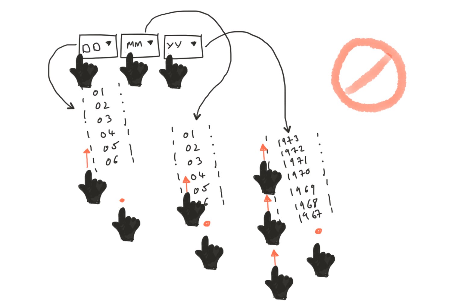
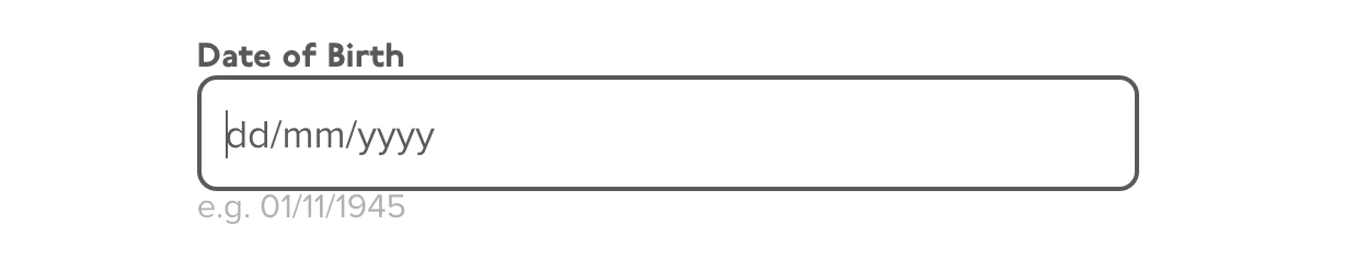
Use input masks instead
To help customers move quickly, we surfaced popular options as buttons and developed input masks to capture numeric information.
Make Helpful Assumptions
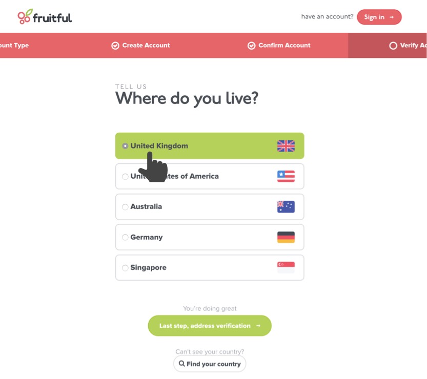
Instead of asking the customer to find their location from a huge long list, we guessed their country of origin from their IP address.
Help customers feel reassured
State & Progress
We wanted to help users feel like they are moving closer to their goal. We did this by building a nav bar which gives users a bird’s-eye view of their progress.
“Humans increase effort as they approach rewards such as gift certificates (Kivetz, Urminsky, & Zheng, 2006) or goals such as visual finish lines (Cheema & Bagchi, 2011).”
The calming interface
The next time you sign-up to a new website — especially one that involves transferring your money — notice how stressful it can be. You’ll become tense around the shoulders asking yourself:
- Did that work?
- Does this mean that?
- Did I add the correct details?
Here are some of the ways we answer those questions and provide reassurance.

Confirming the customers’ success in creating and verifying their account.

Review
- An astonishing 84% of users create an account.
- A further 72% verify their accounts, completing the sign-up process.
- Using Intercom, we ask customers how they felt the sign-up process worked for them. People say they felt it was: simple / straightforward / easy / quick.
- Interestingly, we’ve spoken with a few customers that have created an account, but haven’t started lending. After exploring their reservations, some pointed out they felt the sign-up process was too quick and simple. With other investment accounts they had experienced more friction — such as waiting for account activation codes to be sent in the post.
We still have work to do
- For domestic customers, we automatically verify their identity by querying Experian during the signup process. For international customers, we ask them to submit proof of their identity and address. This has proven to be a sticking point where we see most of our drop-offs.
- To help build trust, better align with customers expectations and improve the number of customers lending with us, we think it would be a smart move to send them a hard copy of their account information.
- It would be interesting to explore the capabilities of mobile phones as a method of authentication. Products such as Apple Pay might provide a low-friction method to verify bank account ownership, among other things.